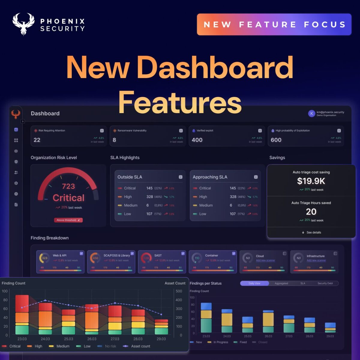
Security teams are under increasing pressure to not only reduce risk within their organization but also demonstrate the effectiveness of their actions through measurable outcomes. ASPM (Application Security Posture Management) is crucial in addressing these challenges. The latest Phoenix Security platform release introduces a new dashboard and metrics, transforming how you track, remediate, and fix vulnerabilities.
With focused enhancements across three key dashboards — Main, Security, and Team — this release integrates powerful data visualizations, performance insights, and streamlined navigation to drive faster, more intelligent decision-making.
Main Dashboard Features
- New Features:
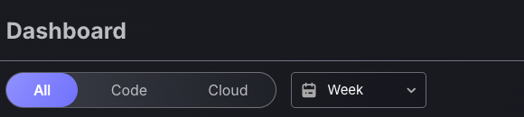
- Global Scope and Time-frame Switches: Select time frames and focus on AppSec (Code), OpSec (Cloud), or both for a uniform experience.
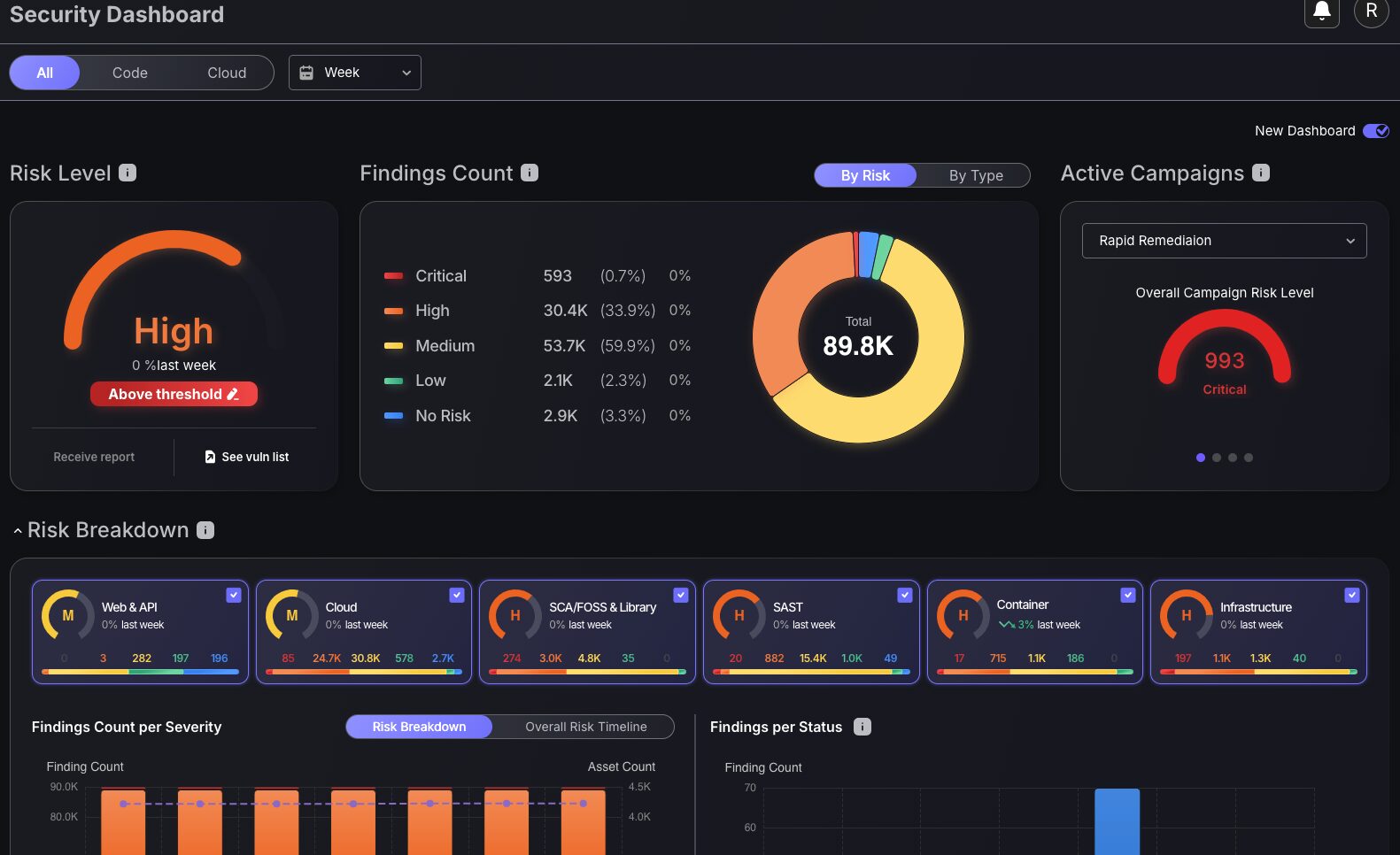
- Interactive Findings Breakdown: Customizable interface with attack surface filters and enhanced charts: Findings Count per Severity, Findings per Status, and SLA status metrics.
- Detailed SLA Status: Tracks SLA compliance by severity for prioritized vulnerability management.
- Top 10 Vulnerability Metrics: Triage with color-coded criticality tiles, linking to detailed findings analysis.
- Detailed Insights into Findings by Risk and Type: Interactive overview with customizable views, including a new “By Type” perspective for Web & API, Cloud, and Infrastructure vulnerabilities.
- Exposure Cost Monitoring: Tracks overall financial impact.
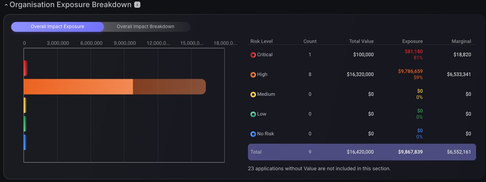
- Organization Exposure Breakdown: Dual-view dashboards with Overall Impact Exposure chart and segmented pie chart for comprehensive risk visibility.
- Exposure Over Time Graph: Interactive timeline charts showing financial exposure trends to quantify remediation impact and support budget justification.
- Existing Features:
- Overall Risk Level: A risk dial that provides a snapshot of the security posture, plus the ability to view details on the actions required to stay under the threshold.
- Impact and Risk Explorer: Visualizes vulnerabilities by business units, with color-coded criticality for prioritized remediation.
- Applications Outside and Inside Tolerance: Color-coded indicators to identify applications exceeding risk thresholds, with direct access to underlying assets.
Security Dashboard Features
- New Features:
- Main Dashboard Features Integration: All new Main Dashboard features (listed above) are included for consistent analysis.
- Campaign Status Management: Four campaign chart options showing risk levels, risk categories, ticket statuses, and SLA compliance for prioritization and progress tracking.
- Team Progress Tracking: Best Changes and Lowest Change Frequency charts with toggle options (Risk Magnitude or Number of Fixes) to assess weekly team performance.
- Existing Features:
- Top 10 Vulnerable Libraries: Identifies high-risk dependencies with severity-based color coding and filtering for streamlined remediation.
- Top 10 Vulnerabilities: Displays the highest Vulnerabilities by risk magnitude and affected application counts, with direct navigation to detailed findings.
- Top 10 Installed Software/OS: Prioritizes the most vulnerable Software/OS by risk magnitude, showing affected applications and assets.
- OWASP Top 10 / Issue Types: Table with OWASP Top 10 categorized and sorted by risk magnitude.
Teams Dashboard Features
- Main Team Dashboard Features:
- New Features:
- Best Changes and Lowest Change Frequency Charts: Visualizes top-performing teams and areas needing improvement, with filters for number of fixes or risk magnitude.
- Existing Features:
- Best Performers and Opportunity to Improve Charts: Tracks risk magnitude across teams and time periods to identify performance patterns and resource needs.
- Teams Performance Table: Displays resolved and new findings alongside assigned applications, environments, and services for contextual performance evaluation.
- New Features:
- Team-Specific Dashboard Features:
- New Features:
- Main Dashboard Integration: All new Main Dashboard features are available, filtered by team for focused oversight.
- Mean Time to Resolution Charts: Historical data on average finding closure times, with attack surface filtering to optimize remediation strategies.
- Findings Status Timeline: Color-coded timeline of cumulative findings (open, in-progress, resolved) to identify bottlenecks and demonstrate program effectiveness.
- New Features:
Dashboard Customization
Phoenix Security ASPM enables security teams or individual team members to customize the dashboard metrics based on their preferences. Individuals can further customize which metric and element of the dashboard will be visible to them, while administrators are empowered to define which metrics are in scope for the business or teams.

Executive Dashboard
After extensive consultation with our users, we are pleased to introduce the following enhanced main dashboard layout and functionality features:
Global Scope and Time-frame Switches
Application and infrastructure security often operate in silos, with AppSec teams focusing on code, while cloud security engineers focus on tracking infrastructure risks. That division can create blind spots, especially when teams prioritize one domain over the other.
Phoenix Security solves this by introducing Global Scope Filtering, allowing every dashboard, metric, and visualization to be instantly toggled between:
- Code (AppSec): vulnerabilities in applications, APIs, CI/CD pipelines, and software dependencies.
- Cloud (OpSec): misconfigurations, infrastructure exposures, identity risks, and cloud-native vulnerabilities.
This filter system ensures that both domains, application and operational, receive equal visibility and analytical depth. Whether you’re tracking unresolved vulnerabilities, SLA compliance, team performance, or risk exposure trends, the data respects your chosen context.
For instance:
- Remediation teams can triage based on the attack surface.
- Security leads can focus on AppSec findings during sprint reviews, then switch to Cloud risks for quarterly compliance audits.
- CISOs can use financial exposure charts, scoped to cloud or code, to quantify risks by business domain.
Detailed Insights into Findings by Risk and Type
Security teams benefit from an interactive findings overview that breaks down risks into various categories with a customizable view. This has been enhanced by adding an additional feature to switch to a “By Type” perspective, which reveals specific vulnerability areas, such as Web & API, Cloud, and Infrastructure. This detailed layout supports precise vulnerability management planning.
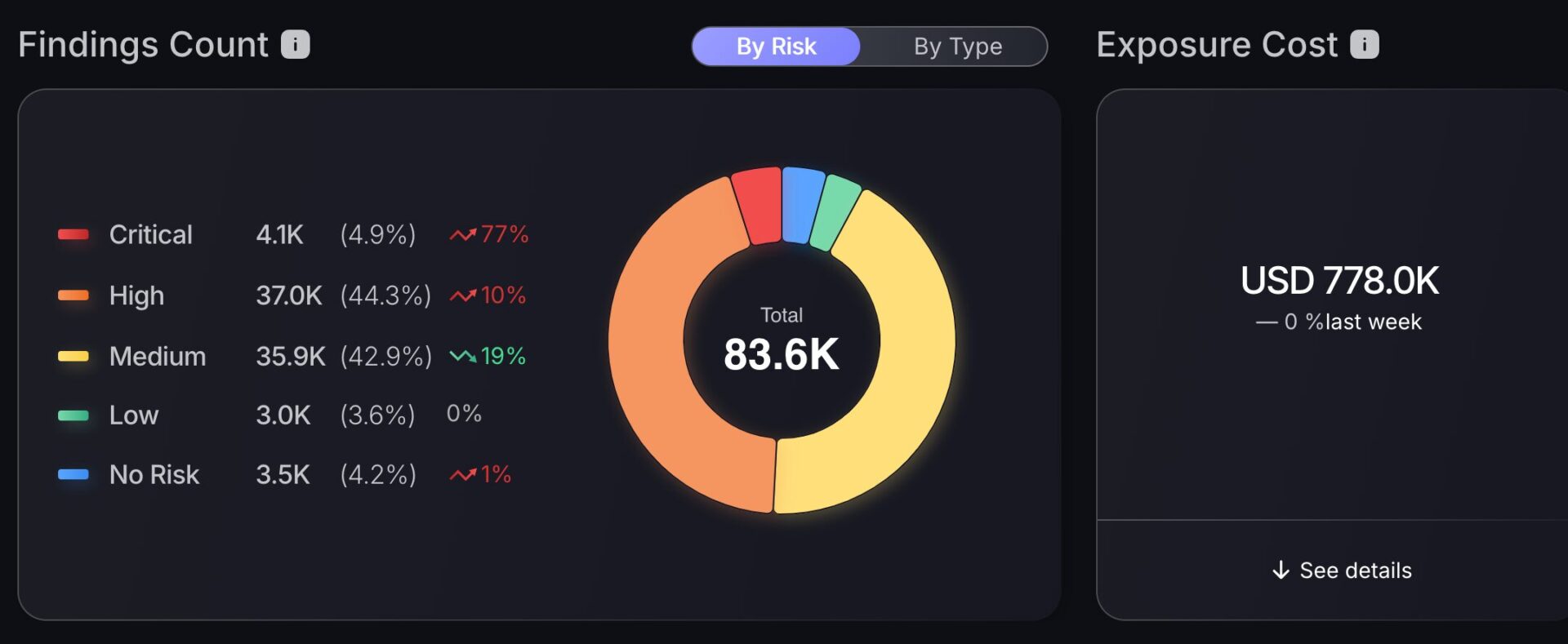
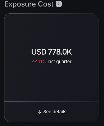
Exposure Cost Monitoring
The dashboard introduces an exposure cost tracker; this quantification enables CISOs and business leaders to communicate in terms of contextualized risk and quantify the impact of the vulnerability in the overall organization. Paired with an organization exposure breakdown, with “See details” link providing a shortcut to the Exposure over time graph, aiding in strategic resource planning for vulnerability mitigation.
Organization Exposure Breakdown
The overall impact breakdown provides a Factor Analysis of Information Risk or FAIR analysis, showing the financial impact of vulnerability exploitation. The effect on the business is calculated based on the overall risk level of the application. Using the Overall Impact Exposure chart, coupled with understanding how vulnerabilities are distributed among different application groups through the Overall Impact breakdown segmented pie chart, provides complete context for strategic security decisions. This multi-faceted approach enables more sophisticated risk management strategies by revealing both the magnitude of exposure and the breadth of impact across the organizational security landscape.

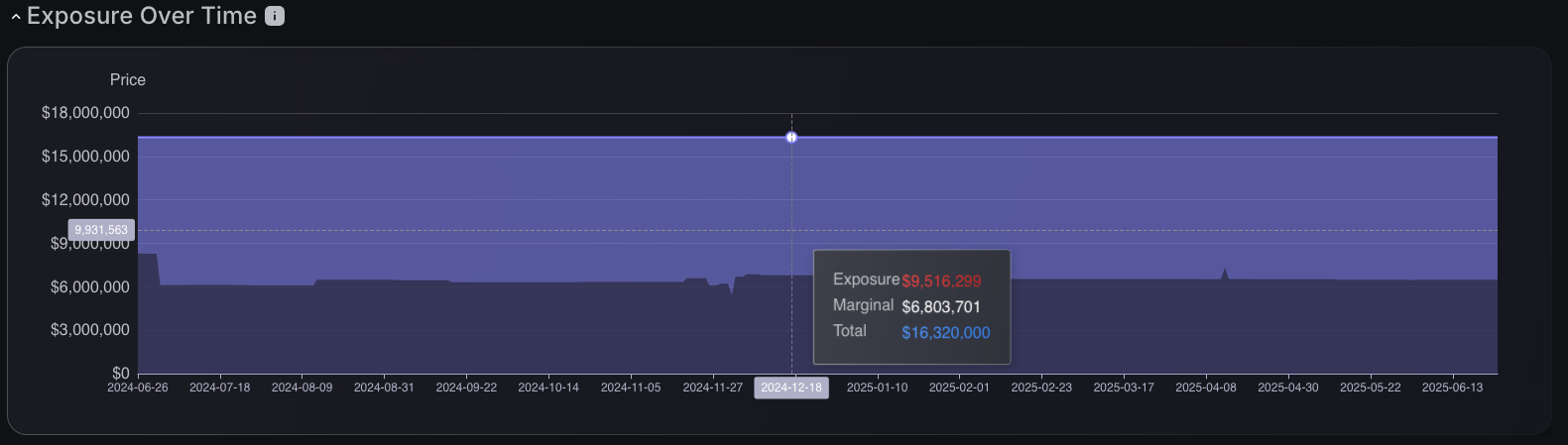
Exposure Over Time Graph

Exposure over time tracking provides temporal visibility into the evolution of security risks through interactive timeline charts that display financial exposure trends across specified periods, enabling CISOs to communicate risk in business terms that resonate with executives and leadership. Security teams can monitor how remediation efforts impact overall risk levels while quantifying the monetary value of vulnerability reduction, transforming abstract security metrics into concrete financial achievements. The interactive timeline enables detailed examination of specific time points, revealing precise exposure values and marginal calculations that support budget justification. This monetized approach empowers CISOs to measure remediation effectiveness in financial terms, predict future risk trajectories with business impact context, and demonstrate the tangible value of their security programs to boards and executive stakeholders through quantified risk reduction.
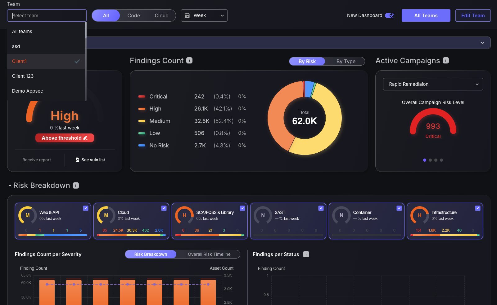
Interactive Findings Breakdown
Software deployed in cloud environments plays a crucial role in Application Security Posture Management (ASPM), enabling users to gain in-depth insights into vulnerabilities. The consolidated view in the Vulnerability and Finding Breakdown screen provides a more engaging and customizable interface. Users can filter data by attack surface, unlocking a detailed view of charts like Findings Count per Severity, Findings per Status, and SLA status metrics. This highly tailored approach ensures a clearer picture of criticality across different attack surfaces and supports streamlining vulnerability management.
The upgraded Findings Count per Severity chart now groups criticality levels within findings and asset count scales, with a handy shortcut to the findings page. In addition, the innovative Findings per Status chart transforms vulnerability tracking. It provides real-time counts of new, open, and closed tickets, all of which depend on your attack surface selection, revolutionizing how teams manage and prioritize issues.
This interactive toolset not only enhances visibility but also accelerates decision-making, making it indispensable for effective vulnerability management in ASPM.
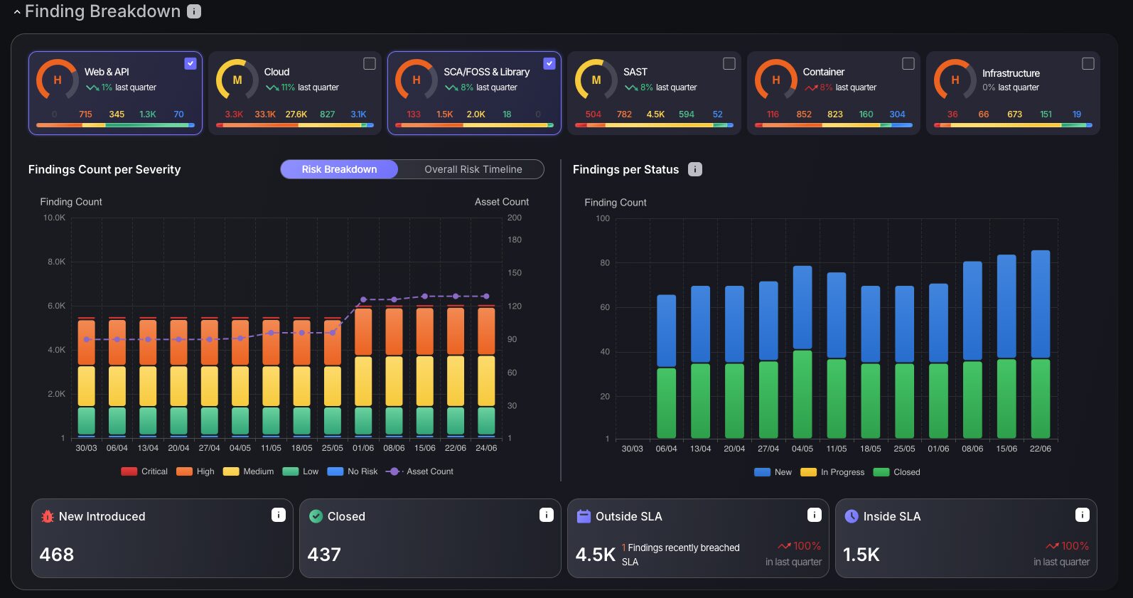
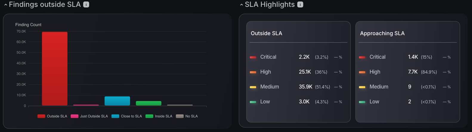
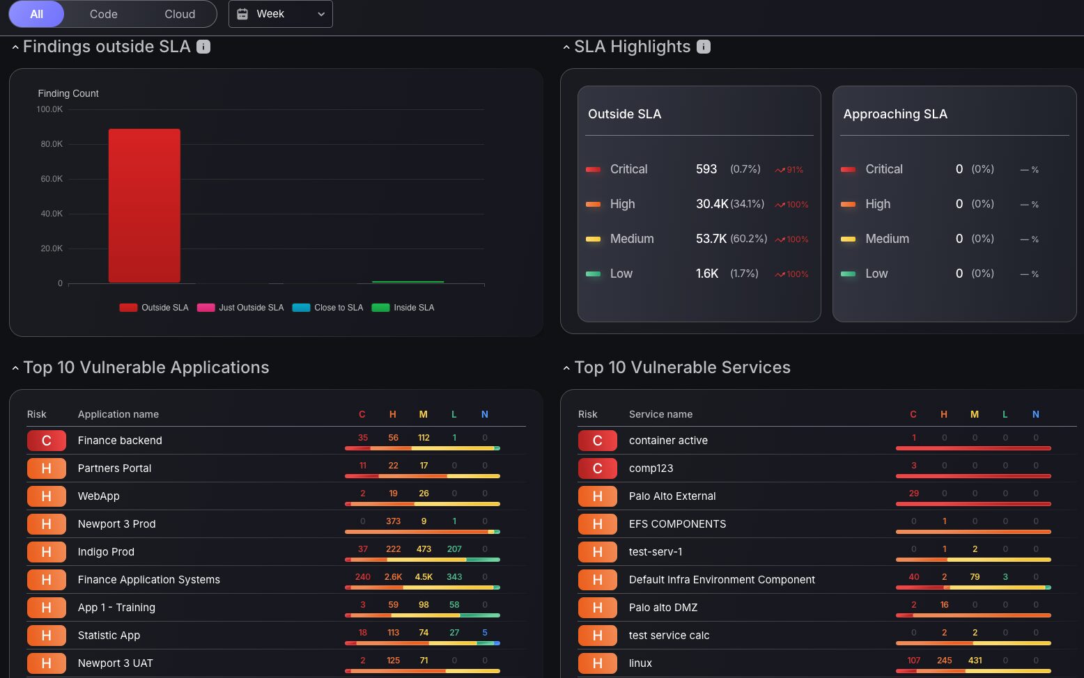
Detailed SLA Status
The introduction of SLA metrics into the dashboard now makes prioritization of vulnerabilities as clear and efficient as ever. Track SLA based on compliance status and drill down on severity level to prioritize vulnerabilities that matter most. The SLA Highlights table provides the number of findings by severity level outside and approaching the SLA threshold, giving you relevant information on what needs to be fixed to achieve a specific risk profile. Let’s say you needed to reduce the number of vulnerabilities outside of SLA, this table allows you to see what needs to be fixed to reduce your overall risk level by the most significant amount.
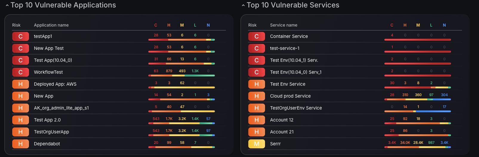
Top 10 Vulnerability Metrics
The dashboard now includes the Top 10 vulnerability metrics, featuring a quick triage option for Applications and Services. Clicking on the Runtime or Services filter takes you directly to the findings page for in-depth analysis of the critical findings. Colour-coded criticality tiles, each showing the number of findings per criticality group, provide a detailed breakdown of the severity levels.
Existing Features
Overall Risk Level
The Risk Level overview dial provides an immediate and comprehensive risk level overview, offering a clear snapshot of your organization’s security posture based on vulnerability assessments across all monitored assets. The risk level is calculated using an advanced formula that incorporates multiple key factors, including the density of vulnerabilities, the probability of an exploit, whether threats are internal or external, the criticality of affected assets, and the technology involved. This aggregated approach ensures a more thorough and nuanced assessment, tailored to the organization’s specific thresholds, providing a foundation for ASPM and vulnerability management by reflecting the complexity and context of potential risks.
To support alignment with the defined Risk Appetite target, the widget includes an expandable view that provides a detailed breakdown of the actions required to bring the current risk score to within an acceptable limit. This view highlights the total number of unresolved findings, along with associated applications and environments that are currently exceeding the risk threshold. It also includes an Estimated Resolution Time, providing a data-informed projection of the time required for remediation based on historical team performance, helping teams prioritize and plan more effectively.
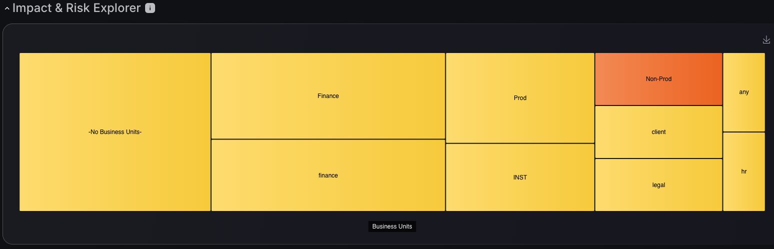
Impact and Risk Explorer
This powerful tool redefines how organizations monitor and prioritize vulnerabilities by organizing them into distinct business units or functional area. This visual representation scales with its criticality, ensuring critical areas of the organization receive the attention they deserve. Through intuitive color-coded segregation, no high-risk zone is overlooked, ensuring teams to focus their efforts where they matter most.
The Impact and Risk Explorer offers a streamlined approach to ASPM, enabling precise vulnerability management. By visualizing the organizational impact, teams get clarity on where to allocate resources effectively.
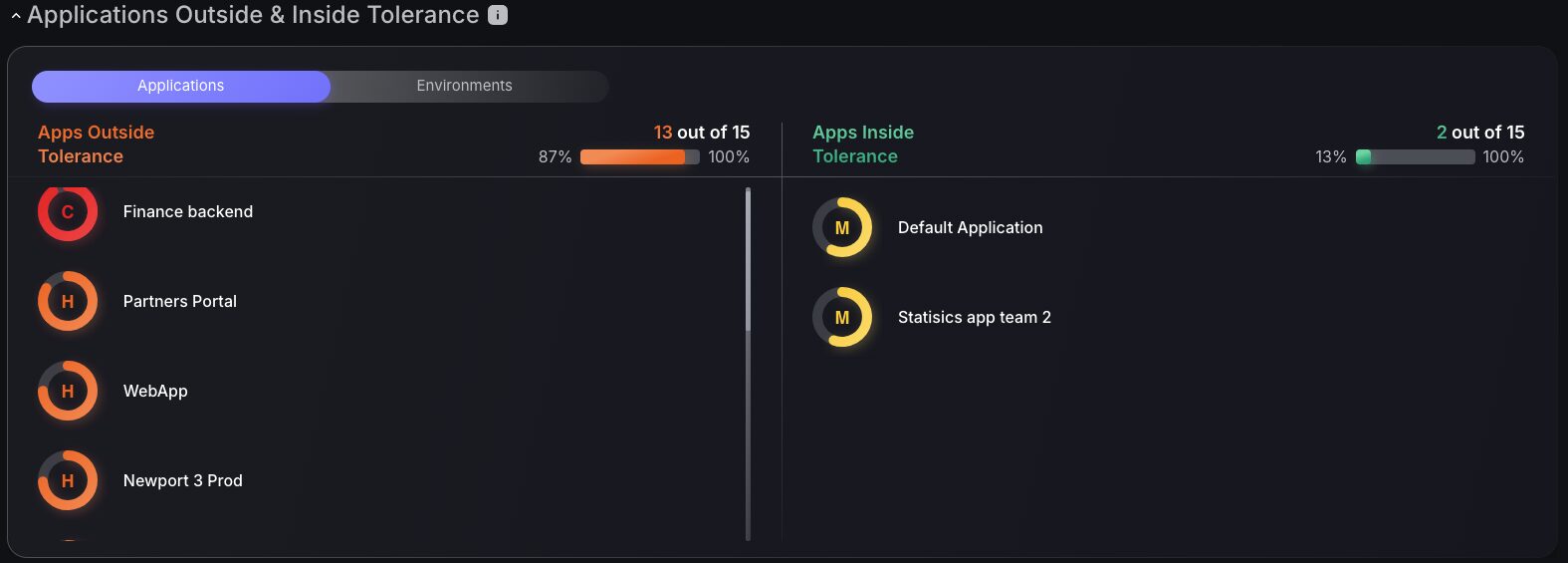
Applications Outside and Inside Tolerance
Risk tolerance filtering enhances ASPM by visually distinguishing between applications that exceed acceptable security thresholds and those operating within safe parameters, using color-coded indicators. Security teams can quickly identify which applications require immediate attention while maintaining visibility across their entire portfolio, with interactive functionality that allows direct access to underlying assets/components or services. This approach streamlines vulnerability management by enabling focused remediation efforts on high-risk applications while optimizing security resource allocation across the organization.
Security Dashboard
All of the new features implemented to the Main Dashboard have also been updated in the Security dashboard for a familiarized analysis of dashboard charts and tools.
New Security Dashboard Features
Additional new analytics support rapid assessments of:
- Campaign status management
- Team progress tracking
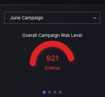
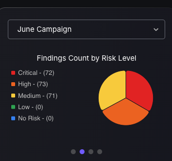
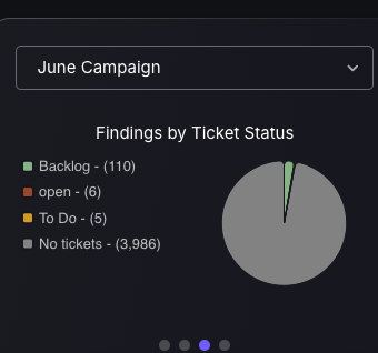
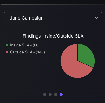
Campaign Management Tile
Security users gain quick access to in-depth analysis of Campaign status through a selection of four different Campaign dashboard style charts. Each chart offers specific value: one shows campaign risk levels for prioritization, and the other details risk categories for resource allocation. Charts on ticket statuses and SLA compliance track progress, ensuring efficiency.
These dashboards enhance security strategies, providing real-time analytics for a robust defense against threats.
 |  |
 |  |
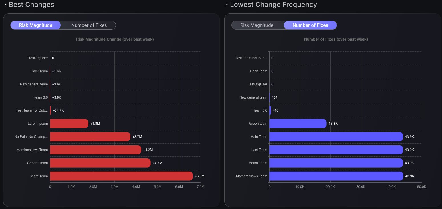
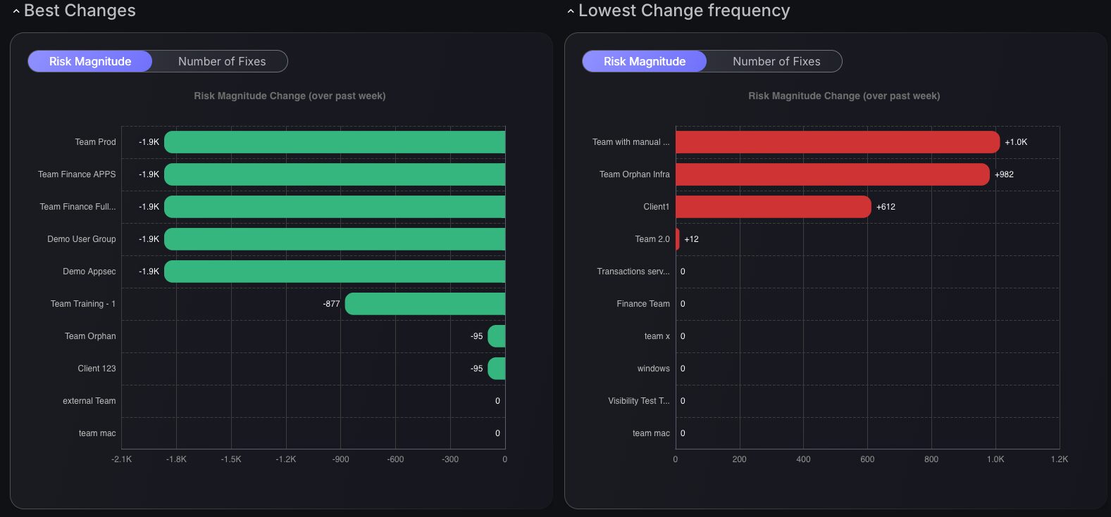
Team Progress Tracking
The Best Changes and Lowest Change Frequency charts bring bar graphs with exciting toggle options between Risk Magnitude and Number of Fixes, unveiling insights into team performance over the past week. This dashboard identifies new areas for improvement in management. Weekly performance reviews uncover essential areas of focus, driving enhanced team efficiency.
Each chart type delivers targeted value. Best Changes highlights top improvements, while Lowest Change Frequency identifies areas that need attention. Together, they streamline workflows, boosting overall security resilience.
Integrating these new dashboard features empowers teams to tackle vulnerabilities, fostering a proactive security stance that is effective.
Existing Security Dashboard Features
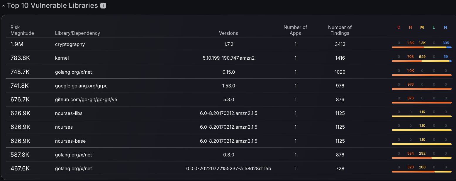
Top 10 Vulnerable Libraries
The top vulnerable libraries ranking provides comprehensive visibility into supply chain security risks by identifying the most problematic dependencies across organizational codebases through risk magnitude scoring and vulnerability criticality distribution analysis. Security teams can prioritize remediation efforts by examining library versions, application usage patterns, and finding counts to understand which dependencies pose the greatest threat to the organizational security posture. The severity-based color coding system enables the rapid identification of critical, high, medium, and low-risk libraries, streamlining vulnerability management workflows and allowing for focused attention on the most critical third-party components. With the interactivity to select a Library to filter findings by, security teams get streamlined access to critical data to make informed decisions. This risk intelligence empowers development and security teams to make informed decisions about dependency updates, library replacements, and remediation timelines.
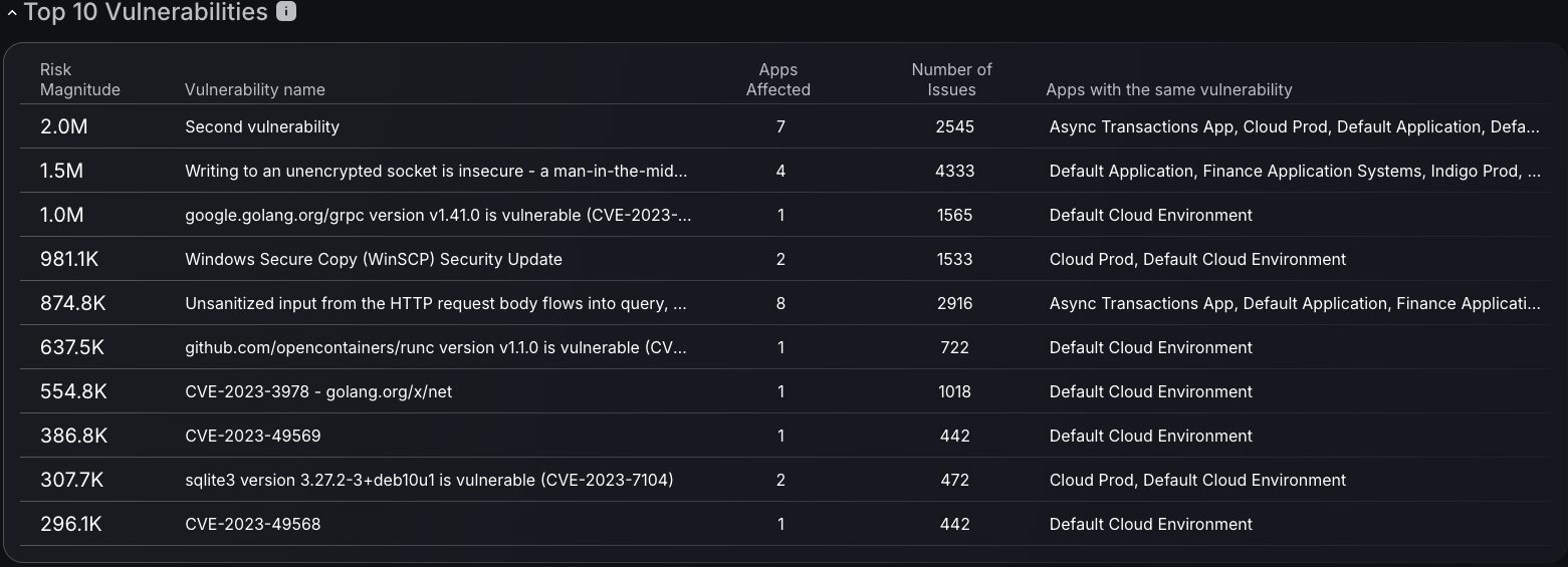
Top 10 Vulnerabilities
Top vulnerabilities ranking displays risk magnitude alongside affected application counts, enabling security teams to assess which vulnerabilities pose the greatest organizational threat. The interactive functionality allows direct navigation from vulnerability entries to detailed findings pages, providing immediate access to all instances of specific vulnerabilities without manual searching. This streamlined approach accelerates vulnerability management by connecting high-level risk assessment with granular finding details, enabling seamless transition from strategic prioritization to tactical remediation activities.
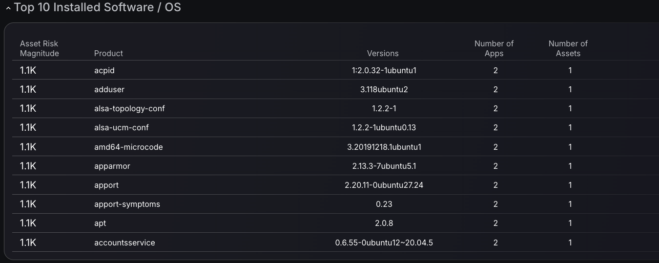
Top 10 Installed Software / OS
This tool prioritizes vulnerabilities by risk magnitude, delivering a focused view into exposure across software products. Make confident, data-driven decisions using metrics like the number of affected applications and linked assets to assess impact and urgency.
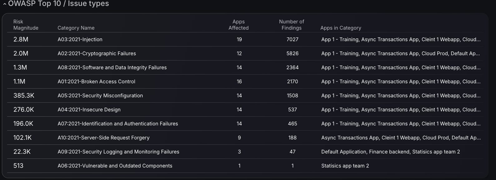
OWASP Top 10 / Issue Types
Explore the OWASP Top 10 vulnerabilities and gain tailored insights into your organization’s exposure to these critical threats. The dashboard presents a table with key metrics, including the number of affected Assets, Applications, and associated findings, offering a comprehensive view of your security landscape. Clicking on a category provides seamless access to the findings page, where all relevant entries are filtered by CVE scores, enhancing your ability to assess and address common vulnerabilities efficiently.
Teams Dashboard Updates
The Teams dashboard contains the main dashboard, which features insights into overall Team progress, as well as an additional dashboard with team-specific progress information for Team managers.
Main Team Dashboard Features
New Best Changes and Lowest Change Frequency Charts
The “Best Changes” chart recognizes top-performing teams, providing a precise measure of their success. Conversely, the “Lowest Change Frequency” chart flags teams requiring additional focus, ensuring balanced improvement across the board. These visualizations offer a detailed view of team performance, allowing leaders to track progress and align efforts with key security objectives. With filtering options to filter performance by number of fixes or by Risk magnitude, it enables a clear comparison of overall team efforts.
Existing Main Team dashboard Features
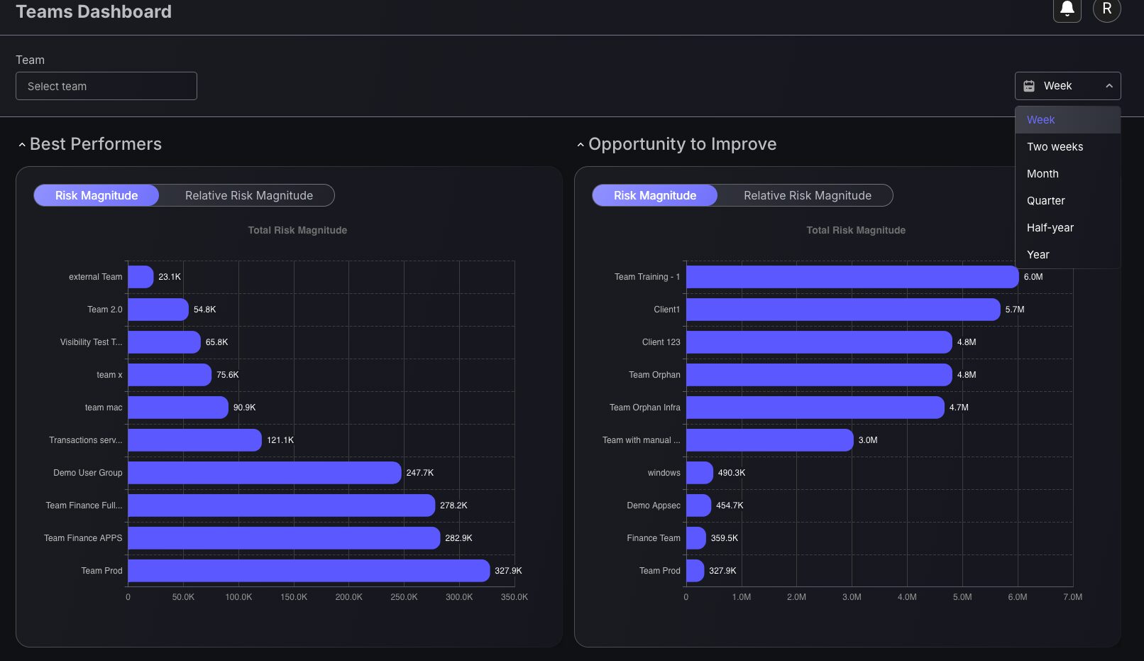
Best Performers and Opportunity to Improve Charts
This dashboard feature displays risk magnitude measurements across different teams and periods, empowering security champion initiatives and enabling managers to identify performance patterns, resource allocation needs, and training opportunities within their organization. Period filtering capabilities enable analysis across different intervals, supporting both short-term tactical decisions and long-term strategic planning for security programs. Tracking team progress by risk magnitude of teams helps security leaders understand which teams consistently maintain lower risk profiles and which may benefit from additional security resources, process improvements, or knowledge transfer from higher-performing units. This team-centric view supports data-driven security management decisions by quantifying relative performance across the organization rather than treating all teams as equivalent security risks.
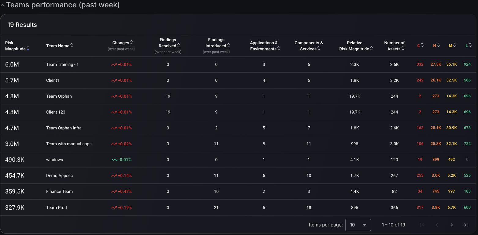
Teams Performance Table
This Team performance table captures resolved and newly introduced findings alongside applications, environments, components, and services assigned to each team, providing the contextual framework necessary for fair performance evaluation and strategic resource planning. The multi-dimensional approach reveals whether teams with higher finding counts are managing proportionally larger attack surfaces or genuinely require security process improvements. At the same time, temporal change indicators highlight performance trends over configurable periods.
Team-specific Dashboard
Use the ‘Filter by team’ option to view all new dashboard features and metrics for that specific team, allowing team leaders to prioritize the vulnerabilities they are responsible for. All features from the main dashboard have also been implemented into team dashboards, enabling team managers to have complete oversight of their team’s security posture.
New features added to specific team dashboards :
- Mean time to resolution charts
- Findings status timeline
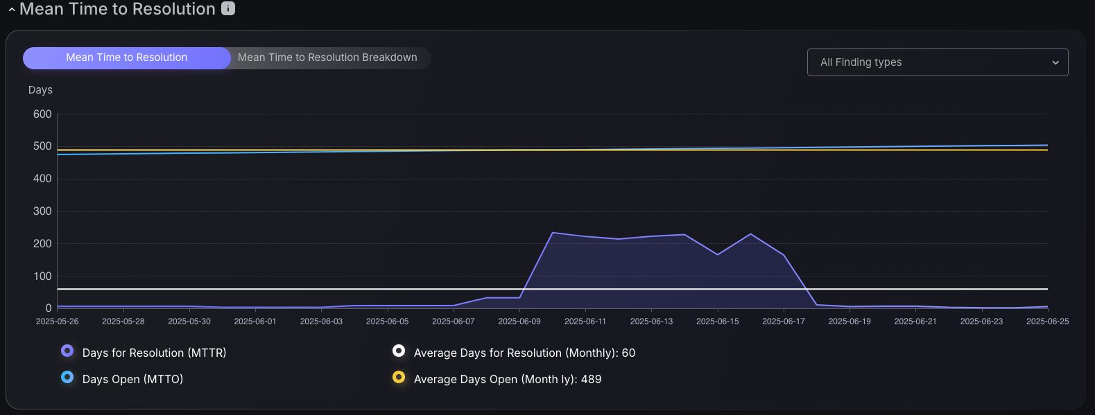
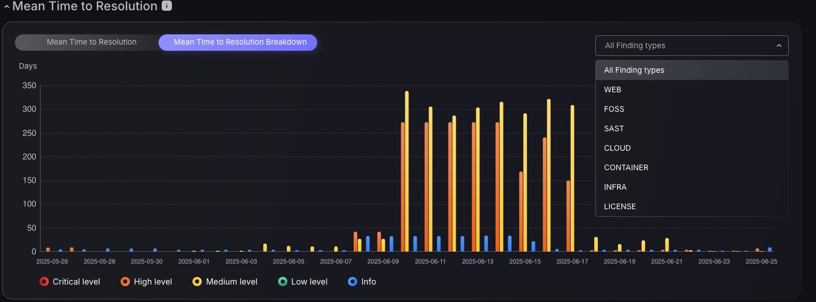
Mean Time to Resolution Charts
Evaluate team effectiveness by examining historical data on average finding closure times with the Mean Time to Resolution chart or the Mean Time to Resolution Breakdown chart. These tools measure the duration of findings that remain unresolved, enabling team managers to craft targeted remediation strategies using insights from past performance. Additionally, filtering findings by attack surface provides a detailed view of team strengths, guiding managers to allocate resources strategically and optimize focus areas.
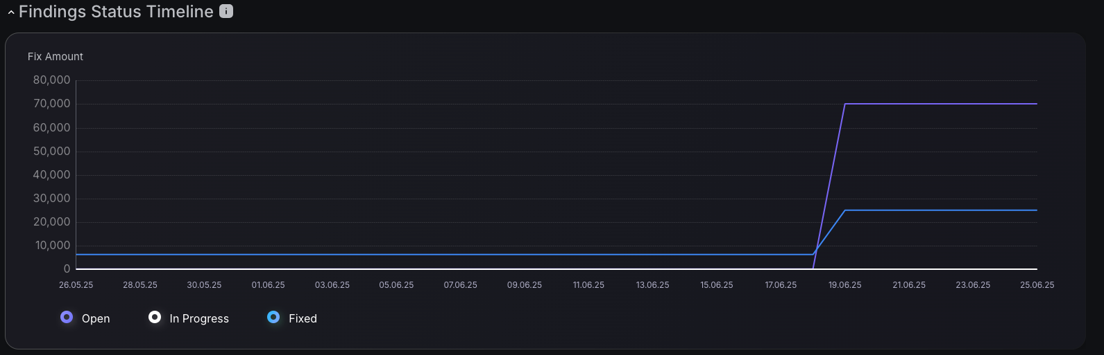
Findings Status Timeline
The Findings Status Timeline transforms traditional vulnerability reporting by displaying cumulative findings over time, with color-coded status indicators that distinguish between open, in-progress, and resolved security issues. This enables security managers to identify capacity bottlenecks, justify staffing decisions during peak discovery periods, and demonstrate program effectiveness through visual trend analysis. The temporal view captures the flow of security assessments, major tool deployments, and the emergence of critical vulnerabilities. At the same time, integrated status tracking provides granular workflow visibility, helping teams optimize remediation processes, predict resource requirements, and communicate the resilience of their security program to executive stakeholders who require clear evidence of risk reduction and operational effectiveness, rather than abstract vulnerability counts.
How Phoenix Security Can Help

Organizations often face an overwhelming volume of security alerts, including false positives and duplicate vulnerabilities, which can distract from real threats. Traditional tools may overwhelm engineers with lengthy, misaligned lists that fail to reflect business objectives or the risk tolerance of product owners.

Phoenix Security offers a transformative solution through its Actionable Application Security Posture Management (ASPM), powered by AI-based Contextual Quantitative analysis and an innovative Threat Centric approach. This innovative approach correlates runtime data with code analysis and leverages the threats that are more likely to lead to zero day attacks and ransomware to deliver a single, prioritized list of vulnerabilities. This list is tailored to the specific needs of engineering teams and aligns with executive goals, reducing noise and focusing efforts on the most critical issues. Why do people talk about Phoenix

• Automated Triage: Phoenix streamlines the triage process using a customizable 4D risk formula, ensuring critical vulnerabilities are addressed promptly by the right teams.
• Contextual Deduplication: Utilizing canary token-based traceability, Phoenix accurately deduplicates and tracks vulnerabilities within application code and deployment environments, allowing teams to concentrate on genuine threats.
• Actionable Threat Intelligence: Phoenix provides real-time insights into vulnerability’ exploitability, combining runtime threat intelligence with application security data for precise risk mitigation.

By leveraging Phoenix Security, you not only unravel the potential threats but also take a significant stride in vulnerability management, ensuring your application security remains up to date and focuses on the key vulnerabilities.